Creating an accessible website for the DeafBlind community
Created for the 25th Knowbility Accessibility Internet Rally (AIR), the site for DeafBlind Youth Engagement & Advocacy was awarded first place in the annual competition.

Background
About Knowbility AIR
The Accessibility Internet Rally (AIR) is a competition to raise awareness for global web accessibility. Knowbility matches teams comprised of developers, designers, project managers, and QA testers to artists, nonprofits, and community groups wanting to receive a new or redesigned accessible site.
Participating teams have eight weeks to build accessible websites, concluding with an independent judging and scoring process based on WCAG accessibility guidelines.
In total, 19 teams participated in 2023 AIR.
Team
Suzanne Deveney, CPACC: PM, UX/UI, Copy
Stephanie Lin: UX, Copy
Carmina Edrozo: Front-End Dev
Jessy Shen: Back-End Dev
CB Averitt, Knowbility Mentor
Project Duration
8 weeks, Fall 2023
Project overview
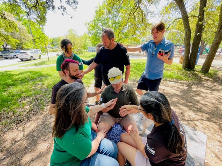
DeafBlind Youth Engagement & Advocacy (DB YEA!) pairs DeafBlind youth from the ages of 14 to 22 with DeafBlind adult mentors. They believe that DeafBlind with DeafBlind is the best way for a DeafBlind person to learn.
Their work follows the DeafBlind way: their journey, their experiences, their choices. In its first full year, DB YEA! is the only program of its kind in Texas.
Goal
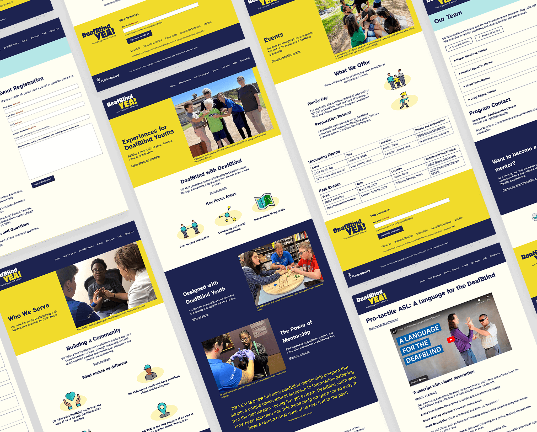
Design and develop a fully accessible website that presents DB YEA! in a professional manner so that parents, youth, mentors, government staff, and community members feel confident in the program and services provided.

The original website
Priorities
Discovery
There was minimal copy on the current website, so the discovery process needed to go in-depth about the program, audience, and mentors. A comprehensive list of questions was created and sent to the client via Google Docs to facilitate a speedy turnaround.
From there, a requirements doc was developed that served as our roadmap for the new website scope.
Timeline
Only eight weeks to design and develop a fully accessible website meant that the team needed to work efficiently and quickly.
Using Smartsheet so the team could collaborate in real-time, a detailed timeline and responsibility matrix was created covering all key phases of the website project: Discovery, UX, UI Design, Development, and Accessibility Testing & QA.
Site structure
With such an aggressive deadline, it was critical that we develop the sitemap and low-fidelity wireframes as soon as possible.
Once the team agreed to the overall direction, we started design with the understanding that some things would change or decisions made as we progressed.
Design system
As the team embarked on the design phase, the audience was at the forefront of every choice that was made. From the clarity of the logo form, to the color palette, through to testing, accessibility was the focus. Even the decision to not include any animation, parallax, or other popular web trend was intentional.
Logo
DB YEA! did not have a defined brand identity, so we wanted to provide the growing organization with a logo that would stand out in the DeafBlind community.
We delivered the logo in three key color ways, in addition to pure black and pure white, to allow for as much flexibility as possible in digital and across other marketing and event materials.
Color
Although DB YEA! did not have formalized color requirements, the client requested that we continue to use blue and yellow, and include a solid blue navigation bar background.
We modified the existing blue and yellow to make them more complementary, and added a secondary color palette so that the website would have more depth and visual interest.
However, it was important to the team that the color palette meet AAA WCAG requirements for all text, versus AA which was the baseline for the AIR program.
Primary color palette
Secondary color palette (accent only)
Typography
Atkinson Hyperlegible was selected as the primary font for its legibility and readability, particularly for those with low vision.
Named after Braille Institute founder, J. Robert Atkinson, Atkinson Hyperlegible focuses on letterform distinction to increase character recognition.

Atkinson Hyperlegible, primary font
Photography and Iconography
Our goal was not to incur any costs for the client, but knew photos and icons would be key to an overall great user experience, especially to break up the dark blue of the primary color palette. The client provided access to a folder of photos and we selected those that represented the vibrant DeafBlind community.
Icons added personality at key moments. We customized royalty free icons from Lordicon with the secondary color palette (plus gray), so icons felt fully integrated into the design system.

Forms
Special attention was paid to form design, as forms are often a point of accessibility failure. The team’s back-end developer conducted extensive research and provided detailed documentation to ensure forms would be available to all users. Ultimately deciding on the Gravity Forms plugin, changes or enhancements were made to make sure it remains accessible in the future. Some of these include:
Ensured that error summary links correctly target input types we didn’t use but the client can add in future forms, such as checkboxes, phone numbers, addresses, and consent boxes.
Enabled forms the client creates later to benefit from the enhanced contrast from our theme.
Added extensive code comments in case the client needs someone else to make changes in the future.

An extensive “form how-to” document was created for the client
Testing and remediation
We employed a rigorous testing and remediation process of in-person usability testing with an assistive technology user, manual testing, and automated tool testing, including:
AccessWorks Usability and Accessibility Testing
Usablenet AQA
WebAIM WAVE evaluation tool
SiteImprove Accessibility Checker
Axe® Dev Tools
NVDA (NonVisual Desktop Access) screen reader
VoiceOver MacOS screen reader
Manual evaluation

The result
Websites were scored on criteria that included 32 accessibility standards, quality of the site such as appropriateness for the audience, and advanced features including data tables, audio, and video. Each instance of inaccessibility resulted in penalty. In total, 470 points were possible.
The team is proud to say the DB YEA! website was awarded first place among an impressive group of 19 submissions.
From Amy Baxter, DB YEA! Administrative Director:
“Every accessibility issue and topic was addressed and well-communicated. Even though my team is primarily hearing-sighted and able, I never felt oppressed or pushed on their views about my DeafBlind programs and needs (which impacted how the website will be set up).
I truly appreciate how open-minded the team was about our disabilities and our discussions about the hidden powers of autonomy and oppression in many of our word choices on the website while tackling the technology aspects, which was another game.
The biggest success lies in the team's investment in the DeafBlind youth programs. The team helped the DeafBlind mentors and youth be seen and heard for the first time PROFESSIONALLY. This kind of program is generally unheard of; therefore, it is always a daily battle to get mentors and youth into our programs for many reasons.
The most significant success is this team's ripple effect on our programs - the DeafBlind communities can be seen and heard; therefore, our program will continue to grow (with enrollment and funding). The team did a great job with understanding my level of technology knowledge and has been more than generous to make sure I have all my bases covered.”